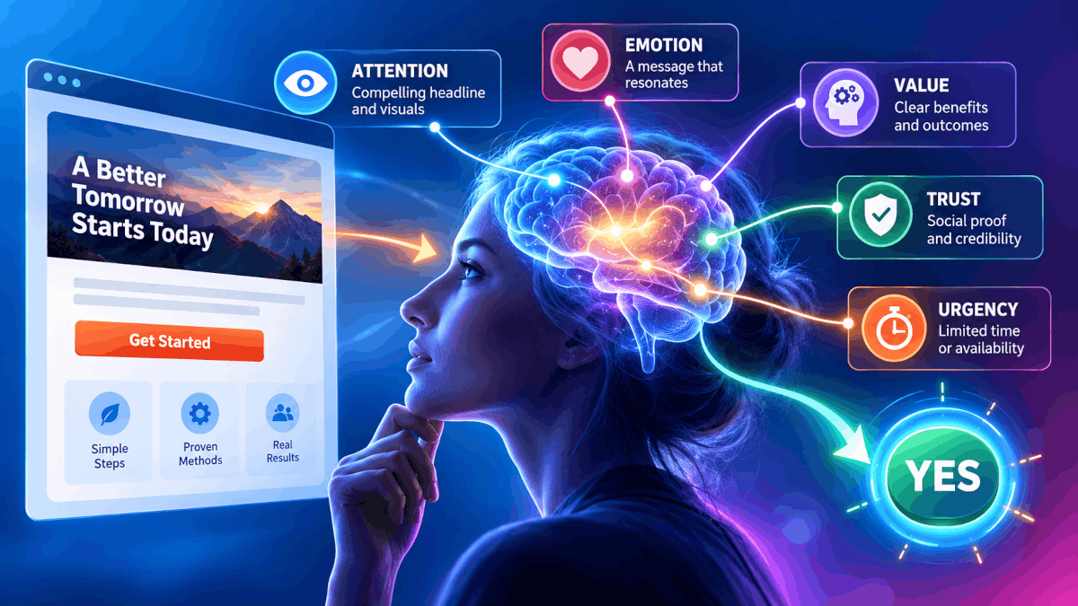
Most landing pages don’t fail because of bad traffic. Instead, they fail because the page loses the visitor in the first few seconds. Sending more people to a page like that is like pouring water into a leaky bucket: you spend more, but you keep nothing extra. Landing pages that convert work differently.
They follow the order in which a visitor’s mind actually makes a decision. In this guide, you’ll learn the five questions every visitor silently asks and how to answer each one on your page. Whether you sell a course, a service, or a physical product, the same psychology applies.
Key Takeaways
| What you’ll do | Why it matters in 2026 | What you get |
|---|---|---|
| Lead with relevance (before design) | Visitors now arrive from ads, emails, social posts and AI answers, each with one specific promise in mind. | Fewer people bounce because they think they clicked the wrong link. |
| Design for the scan (not the read) | Most people skim a page in seconds before they decide to read anything. | Your key message lands even with visitors who never scroll. |
| Prove it with specifics (not superlatives) | Shoppers have seen so many fake reviews that vague praise no longer persuades. | Trust that feels earned, even from a small number of reviews. |
| Give each page one job (and only one) | Every extra link or offer is another decision, and decisions slow people down. | A clear path from arrival to action. |
| Treat doubt as a design problem (not a sales problem) | Hesitation peaks at the button, so that’s where reassurance has to sit. | More visitors who are ready to buy actually click. |
| Improve in big moves (until traffic allows small ones) | Small sites rarely have enough visitors for reliable split tests. | Steady progress without waiting months for test results. |
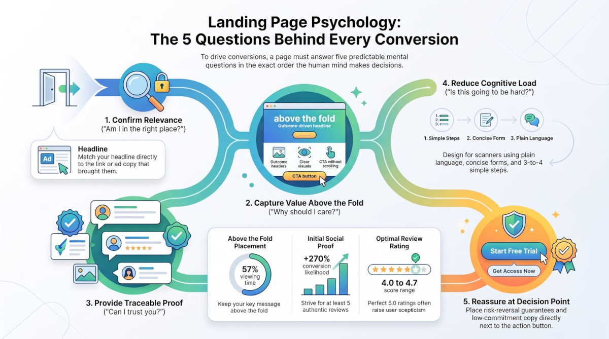
Landing pages that convert answer five silent questions, in order, from the top of the page to the button.
The Psychology Behind Landing Pages That Convert
Every visitor makes a quick, mostly unconscious decision about your page. However, that decision isn’t random. It follows a predictable sequence of questions, and each one needs an answer before the next one matters.
The five questions are:
- Am I in the right place?
- Why should I care?
- Can I trust you?
- Is this going to be hard?
- What if I regret it?
If your page stumbles on any of them, the visitor leaves. In contrast, a page that answers all five in order feels effortless to say yes to. The steps below take each question in turn.
Step 1: "Am I in the Right Place?" Match the Message That Brought Them
The first question is about relevance. A visitor clicks because something promised them a specific thing, whether that was an ad, an email, a social post or a search result. If the page doesn’t confirm that promise straight away, they assume they’ve landed in the wrong place. Then they hit the back button.
The fix is called message match. In practice, it means your headline repeats the core promise of the link that sent people there, ideally in the same words. Similarly, the visuals, colours and offer should feel like a continuation of what they just saw. For example, if your email says “Get the free 7-day meal planner”, the page headline should say the same thing, not “Welcome to Healthy Living Co.”
Why Landing Pages Convert Better With One Job
Relevance also depends on focus. A homepage is built for browsing, so it offers menus, links and several products. Your landing page, on the other hand, should do one job: present one offer with one call to action (CTA).
Every extra option asks the visitor to make another decision. As a result, more choice often leads to no choice at all, a pattern psychologists call choice overload. So remove the top navigation menu, footer links and secondary offers. If something on the page doesn’t help the visitor say yes to this one offer, it’s a hole in the bucket.
Step 2: "Why Should I Care?" Win the First Impression Above the Fold
Once visitors know they’re in the right place, they decide whether the page deserves their time. This judgment happens fast, long before they read a full sentence. Psychologists describe a related bias called the halo effect: when one thing about a page feels polished and relevant, people assume the rest of the business is just as good. Unfortunately, the reverse is also true. A cluttered or slow page casts doubt on everything behind it.
That’s why the top of the page, the part people see before they scroll, deserves most of your effort. Eyetracking research from the Nielsen Norman Group found that people spent about 57% of their viewing time above the fold, and 74% within the first two screens. In other words, if your key message sits halfway down the page, most visitors will never properly see it.
What Landing Pages That Convert Put Above the Fold
- A headline built on the outcome. Answer “why should I care?” with the result the visitor wants, not a description of what you do. A simple trick is the “so that” bridge: take a feature and keep adding “so that…” until you reach the real benefit. “Bookkeeping software” then becomes “Finish your monthly accounts in under an hour”.
- A subheadline that removes effort. Say who the offer is for, and take away the obvious objection, such as time, cost or complexity.
- An image of the result. Show the finished kitchen rather than the cabinet panels, or the relaxed client rather than the spreadsheet.
- One clear CTA button. Make it stand out in colour, and keep it visible without scrolling.
Step 3: "Can I Trust You?" Use Social Proof People Actually Believe
With attention won, the next hurdle is scepticism. People look to others to decide what’s safe, a tendency known as social proof. However, today’s visitors have seen plenty of fake reviews. A line like “Great service! – John S.” barely registers anymore.
Believable proof is specific and traceable. It usually includes at least one of these:
- A real identity: a full name, photo, job title or location.
- Visible evidence: before-and-after photos, screenshots of results or a short video.
- An outside source: a badge or link showing the review came from Google, Trustpilot or a similar platform.
Placement matters too. Don’t hide testimonials in a slider that visitors have to click through. Instead, stack them so people see several at once as they scroll.
What If You Don't Have Many Reviews Yet?
The good news is that you need fewer than you think. Research from Northwestern University’s Spiegel Research Centre found that a product with five reviews was 270% more likely to sell than one with none. After those first five, the benefit of each extra review dropped off quickly. Interestingly, the same study found that purchase likelihood peaked at ratings between 4.0 and 4.7, because a perfect 5.0 can look too good to be true.
So start small. Offer a few early customers or beta users a discount in exchange for honest feedback. You can also show your process, share work samples or describe specific results you’ve achieved. Concrete details persuade far more than big claims.
Step 4: "Is This Going to Be Hard?" Cut the Cognitive Load
Even a trusted offer can lose people if the page feels like work. Our brains can only handle so much new information at once. When a page is dense or confusing, that mental effort, known as cognitive load, becomes a reason to leave. On the other hand, a page that feels easy creates a sense of cognitive ease, and ease feels like safety.
Most visitors scan rather than read. Therefore, your headings should tell the whole story on their own. Replace labels like “How It Works” or “Testimonials” with statements that carry a benefit, such as “Get Your First Plan in Three Steps” or “What Our Members Achieved Last Year”.
A few simple habits make a big difference:
- Write plainly. Use short sentences and everyday words, and cut the jargon.
- Break up text. Use bullet points, icons and white space instead of long paragraphs.
- Show the process in three or four steps. More steps make the whole thing look like effort.
- Shorten your form. Ask only for what you truly need. For instance, one “Full name” field is easier than separate boxes for first and last names.
- Build a clear visual hierarchy. Size, weight and colour should tell the eye what matters most.
Step 5: "What If I Regret It?" Use Risk Reversal at the Moment of Decision
The last question appears right at the button. This is where loss aversion kicks in. Behavioural research shows that people tend to feel a loss more strongly than an equal gain. So even when someone wants your offer, the fear of wasting money or time can make them hesitate.
Risk reversal tackles this fear directly. It shifts the risk from the buyer to you, through a money-back guarantee, a free trial, a refund window or a “cancel anytime” promise. Crucially, place this reassurance right next to or just below your CTA. Doubt peaks at that moment, so that’s where the answer needs to be.
Your button text can help as well. Words like “Buy now” or “Sign up” sound like a big commitment. By contrast, “Start my free trial” or “Get the checklist” sound like a small, safe step. Finally, a short line beneath the button, such as “No card needed” or “Unsubscribe in one click”, removes the last small worry.
Step 6: Keep Improving Landing Pages That Convert
A landing page is never really finished. However, the usual advice to “A/B test everything” assumes you have plenty of traffic. A split test compares two versions of a page, and it needs a lot of visitors before the result means anything. With only a few hundred visitors a month, a small test could run for months and still prove nothing.
If your traffic is modest, make bigger, research-based changes instead. Rewrite the headline around the outcome, add real proof or remove the navigation. Then compare the results over a few weeks. Meanwhile, gather direct feedback. Ask five people from your target audience to look at the page for five seconds, then tell you what you offer. Free tools such as Microsoft Clarity can also show recordings of where people stop or hesitate.
Once traffic grows, switch to proper testing. Test one element at a time, and start above the fold, since that’s where most attention goes. Keep a simple log of each test: what you changed, which version won and whether it beat the original. Over time, those small wins add up.
Quick Recap: Landing Pages That Convert
- Match the message that sent visitors to your page, and give the page one job.
- Put an outcome-driven headline, a result image and your CTA above the fold.
- Use specific, traceable social proof, even if you only have a handful of reviews.
- Make the page easy to scan, with plain words, short forms and three or four steps.
- Place a guarantee or reassurance right beside your CTA.
- Improve with big changes while traffic is low, then test one element at a time.
Frequently Asked Questions
What makes a landing page convert?
A landing page converts when it answers the visitor’s doubts in the right order. It needs to confirm relevance, show a clear benefit, prove trust, feel easy and remove risk. Above all, it should focus on one offer and one call to action.
What is a good landing page conversion rate?
There’s no single benchmark, because conversion rates vary widely by industry, offer and traffic source. A free download usually converts far better than an expensive product. So the most useful benchmark is your own page’s past performance.
Do landing pages that convert need a navigation menu?
Usually not. A navigation menu gives visitors easy ways to leave without acting. Most landing pages remove the main menu and keep only essential links, such as a privacy policy.
How long should a landing page be to convert well?
It depends on the price and complexity of the offer. A free checklist might need only one screen. Meanwhile, an expensive service needs more room for proof, detail and answers to objections. Either way, put the essentials above the fold.
How can I add social proof with no customers?
Start by offering early users a discount or free access in exchange for honest reviews. You can also share work samples, results you’ve achieved yourself, credentials or press mentions. Specific details always beat vague praise.
Do I need A/B testing for a small website?
Not at first. A/B tests need a lot of traffic to give reliable results. Until you have it, make bigger changes based on proven principles, and gather direct feedback from real people.
What is risk reversal on a landing page?
Risk reversal means moving the risk of buying from the customer to you. Common examples include money-back guarantees, free trials and “cancel anytime” terms. It works best right beside the call to action.
Over to You
Pick one of the five questions and check how your own landing page answers it today. Start with the one you suspect is weakest. Then leave a comment below and tell us which question your page struggles with most, or share a change that lifted your conversions. Your experience could help another reader fix their page.
